Sooo I finally got around to getting some images put together of stuff I've been doing in school this semester. Let's dive in, shall we?
The following are 4 hour gesture sculptures. I gotta tell you, I wasn't sold much on sculpture until we started doing the full figure. Much more enjoyable, to say the least. Also we got free pizza on our make-up class on saturday, and only 7 people showed up. It was much nicer to have some space to work.
I do wish I had more time with these...they're not nearly as developed as they could be. It's obvious some views I pegged down better than others. 4 hours is not enough! I can't wait to delve into longer poses. Right now we're doing a 2 week pose, next will be our final 5 week pose. It's miraculously made me want to take more sculpture classes, which I never expected myself to say.


 Before we did the full figure though, we did a 5 week portrait. I hated this. It didn't help that the model had very...rotund features, which are even harder to nail down than you would think. Easy to draw, hard to sculpt.


 However after all these projects I managed to get an A- and be one of my teachers more favored students...wtf?
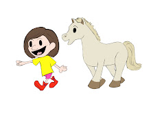
 Ok anyway, photoshop. I love the teacher, hate the projects. They are just painfully boring so far. It's mostly been making selections and manipulating photos. Sigh...I guess its important to know.
Here's a really creepy head swap I did with my roommates friend Gabe. I just look like I am wearing a yellow tshirt, and while that is uncharacteristic of me, not that special. Gabe on the other hand has some creepy neck hair thing going on, as well as bra straps. Attractive.
 This is our latest project, where we are supposed to make something look like it's been graffiti'd with our personal work. I used really old drawings of mine circa 10th grade. It looks kind of cool, although I'm not sure quite how believable it looks. I did everything my teacher suggested... the problem is he never demonstrates anything super, he just shows us what he considers "decent" work. Its very hard to determine what he wants.
 We also did this cyborg manip that I would post except I can't find the jpg and I also used a lot of images off the web without permission, so I really shouldn't anyways.
 Here's some of the more creative assignments we've had in composition and color. I love that class. I love illustrator in general, actually. Vectors are full of win. Also my teacher is hilarious, and really good at teaching. He breaks it down extremely well. Finally, someone who knows what they're doing.
One of our first assignments was to create images demonstrating the principles of design using only the letters in our full name. Thank god there is an I in my name...I don't know what I would have done without it.

 Our latest project consisted of creating a propaganda poster (without using any real language) and explore different color relationships. There were 7 in total, but there were my favorite 3.


 Our latest project consisted of creating a propaganda poster (without using any real language) and explore different color relationships. There were 7 in total, but there were my favorite 3.
Cool sculptures! That looks like a ton of...clay? Is there a whole pipe structure under there or is that one pipe somehow holding everything up?
ReplyDeletehaha, the sculptures are all about 50 lbs of clay. The armature is an L-shaped pipe with coil wire in a sort of humanoid form coming out from either end of it. If you look in the photos you can see it coming out the feet.
ReplyDeleteThe portrait sculpture on the other hand is just a wooden pole with thinner wire that has been double looped around it (so like there are tiny circles along every few inches of the wire that are then wrapped around the pole)